
Pantone Matching
IN DEPTHAlso: PMS matching, color matching, Pantone color
The practice of specifying brand colors by Pantone (PMS) number and matching the print to a physical swatch within a small color difference.
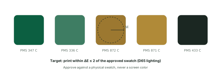
Why Pantone numbers matter
Brand colors are specified as Pantone Matching System (PMS) numbers so everyone is aiming at the same reference. Labs and factories target a small color difference between the approved swatch and the finished print, commonly around ΔE ≤ 2 when measured under D65 lighting. This gives both sides an objective pass-or-fail yardstick instead of arguing over a screen.
Screen color vs physical swatch
An approved physical swatch always beats a screen color. Monitors vary, and a color that looks right on a laptop may print differently on a coated bottle. Sending a physical Pantone chip or a pre-approved production sample removes that ambiguity before the run begins. Even two screens showing the same file can render slightly different tones, which is why the physical reference is non-negotiable for brand work.
For powder-coat colors, the finish is custom-matched in batches, which can carry a minimum order because the coating is blended specifically for your brand. The same logic applies to print inks: closer matching tolerances mean more careful setup and, sometimes, a higher unit cost. Confirm with the factory which tolerance they can realistically hold on your specific coating before you lock a brand standard, because tighter tolerances can affect both cost and the minimum order.
| Step | What to provide |
|---|---|
| Specify the color | Pantone (PMS) number |
| Define the standard | Approved physical swatch or sample |
| Set the tolerance | Typically ΔE ≤ 2 under D65 lighting |
| Confirm the finish | Matched on the actual coating or ink system |
Practical takeaway: Always send an approved physical swatch alongside the Pantone number so the factory matches to a real standard rather than a screen.